Vibe Coding Helped Me Build the Personal Portfolio Theme I’d Always Imagined
More than a decade ago, I used to frequently change my own website’s design. I tried out many HTML, CSS & JavaScript tricks to make the website look interesting or unconventional looking (read not boring). Someday navigating the website would feel like you’re sliding horizontally, someday you would animate to different sections vertically. Someday the website would look like a linux terminal, someday the website would look like a stack of visiting cards. I wish I could share few screenshots here. Slowly life caught up and my website converted into a plain looking blog. In fact, I just bought the theme and be done with it. It stayed like that for years. Until recently I started vibe coding it. I had been vibe coding different things for more than a year. Since about a month ago, I thought may be I can build the personal website which I dreamed to built all the time but didn’t get enough time to do that.
My personal website saadixl.com is WordPress based. I’ve built a WordPress theme with Claude Code, and named it ClaudePress. The site contains different sections which has different meanings. I will try to explain them in this post.
Look & feel
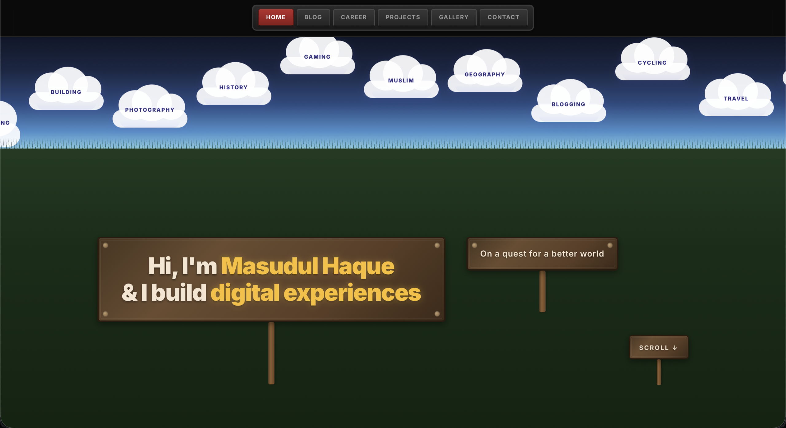
I imagined a indie game like environment with retro elements for the website. That’s why the navigation looks like a cassette player buttons. That’s the first thing you will notice when you visit the website. When you click the menu items, it looks like you just pressed the cassette player button and the active page nav menu item looks like the red record button.


Home Page
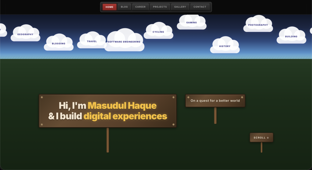
Like other pages, the home page has the sticky cassette player button styled navigation at the top. Then it has a bright blue sky with some floating clouds going from left to right. The clouds contains the things I’m interested in. This gives the visitors a quick overview for myself. Then I added a big green field and added some sign boards to welcome the visitors. I feel the green field and the blue sky above makes the environment calm.
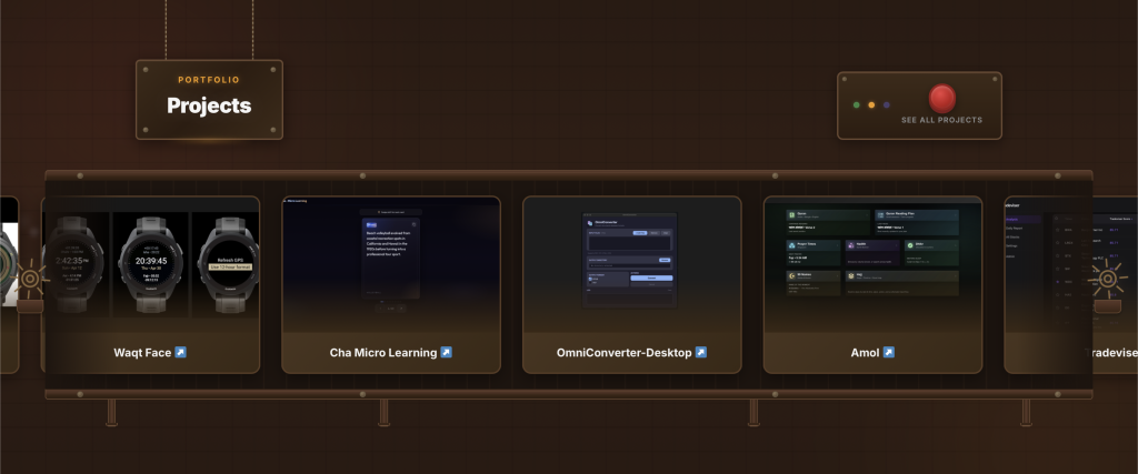
If you scroll below, you see a brown section which looks like a factory. There’s a signboard hanging from top. You see a conveyer belt which moving all my pet projects as production items. Again another symbolic way of showcasing the things I am building. You can click on the red button to see all the projects from the project section.
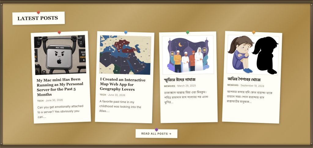
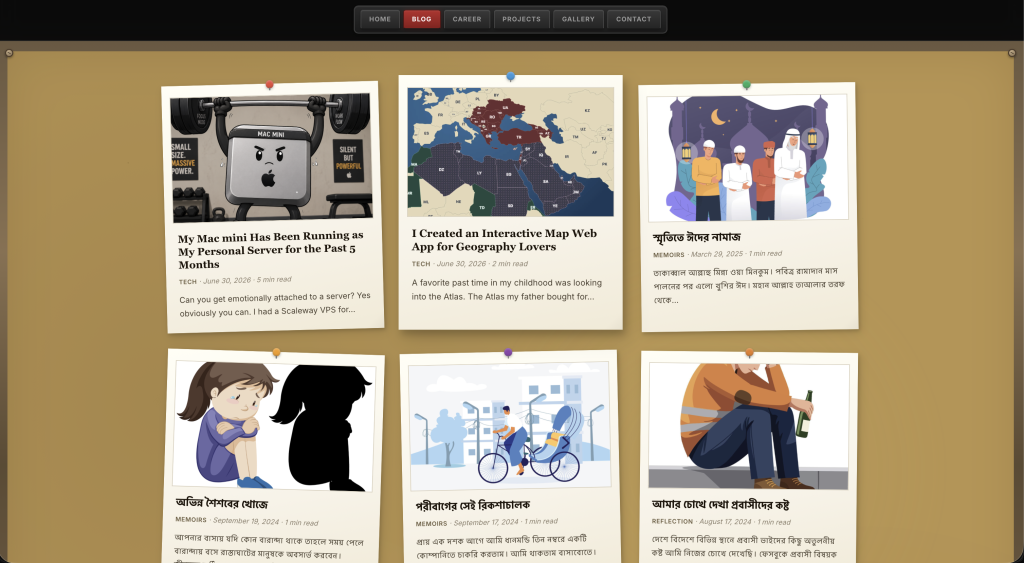
Scrolling below takes you to a notice board like section which contains the recent blog posts. All the items are pinned on the board. The items are not straight, which gives a real notice board like feeling.
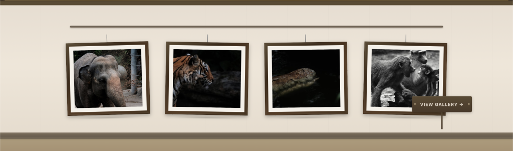
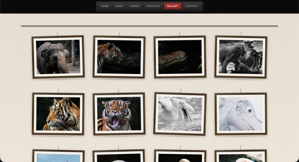
The next section shows four latest photographs I have taken. The section looks like a wall of an exhibition where the images are hanging using a string.
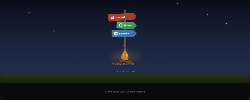
The last section shows that it became night from sunny morning from your scrolling top to bottom of the website. This shows a symbolic meaning that you might have spend the whole day with me. The section contains a night environment, with fire flies flying, and there’s a fireplace with bright orange fire. And there are three directional sign to navigate you. From this point, you can contact me or go visit my Github or LinkedIn.
Blog Page
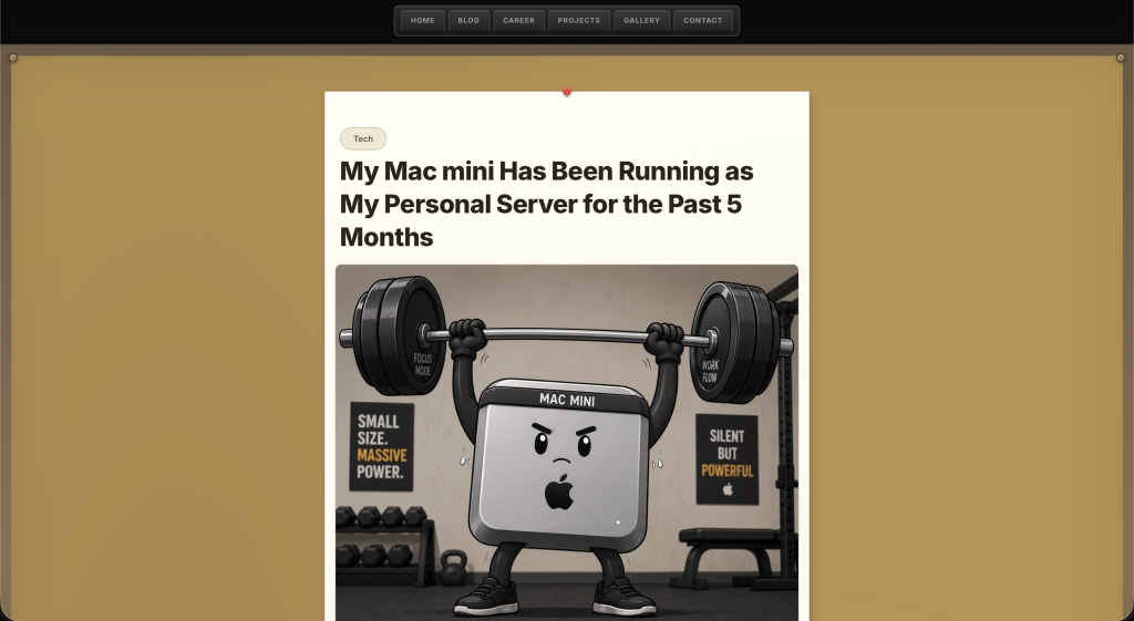
The blog page is just like the recent post section of the home page. It’s like a huge notice board. The single blog posts are just thinner single pages.
Career Page
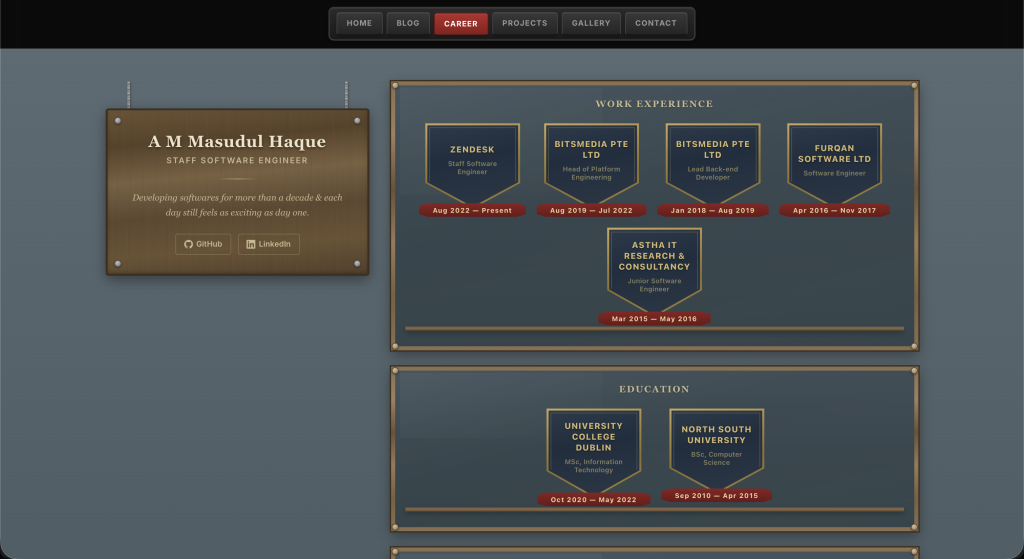
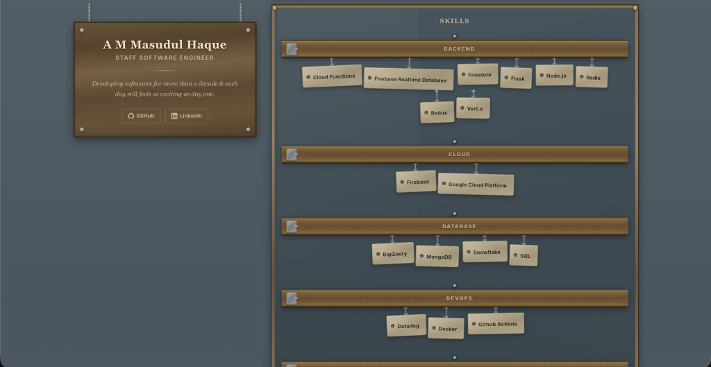
Career page has a name plate, designation and some other things. The work experience and education section looks like a trophy case. Each roles in different companies and degrees look like a crest. And the skills I have, looks like they are hanging on tool belts.
Projects Page
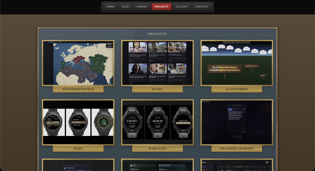
Currently the project page looks like a simple show case. I am not satisfied with this design fully. Still thinking about something more interesting. I might update this section later.
Gallery Page
The gallery page is same as the home page’s gallery section. It looks like a exhibition with hanging picture in frames.
Contact Page
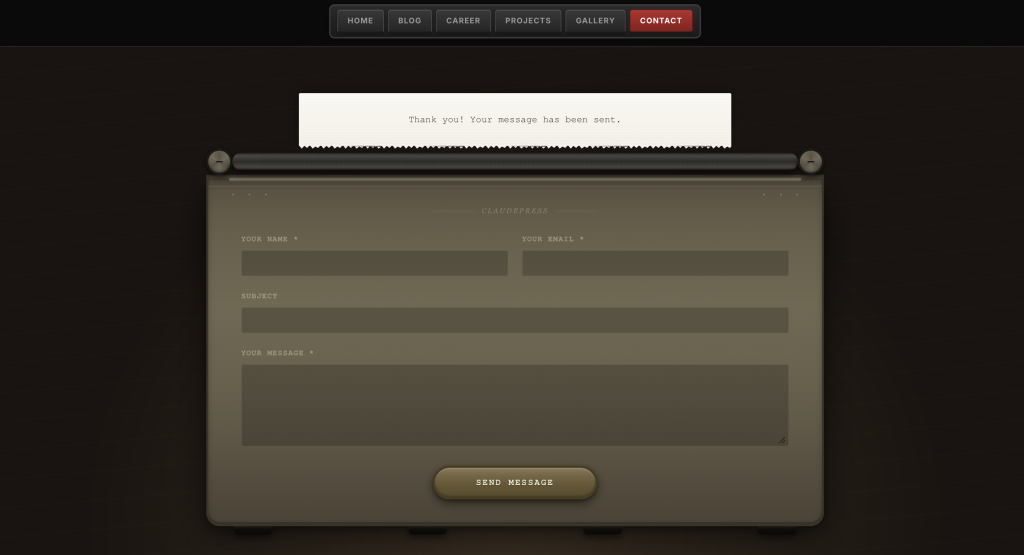
The contact page contains a typewriter looking machine. Instead of the buttons, it has the form fields and a send message button. Once you fill up the form and send the message, the success message looks like a paper came out of the typewriter machine. Still thinking about this section. Might change it later.
The theme is pretty configurable. The clouds, projects, skills, work experiences, education etc all are custom posts or custom fields. Which means they can be easily edited or added. There are some bugs, which I need to fix eventually.
If you have visited the website, I hope you’ve found it little bit interesting. It’s been an absolute pleasure to work on this project. Hopefully I will be able to add more interesting things.